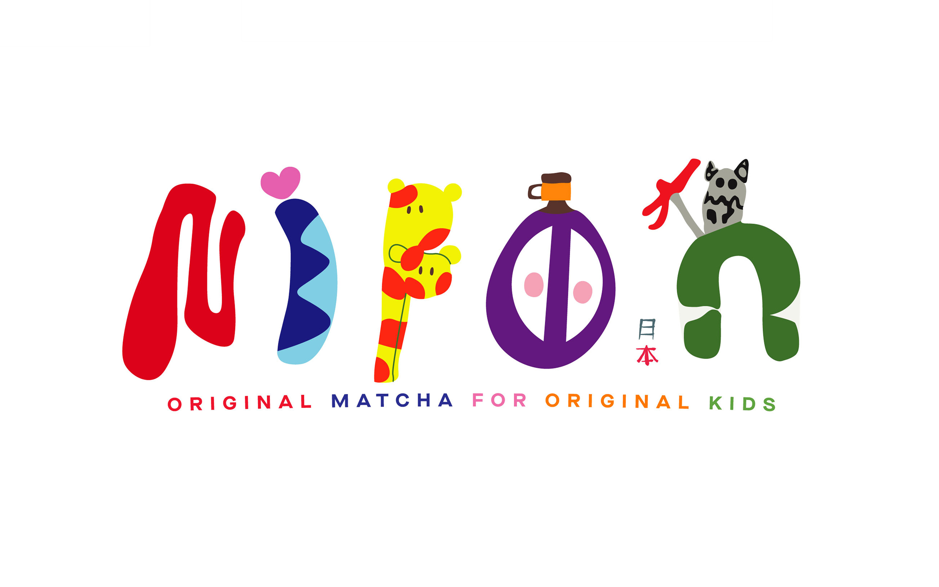
NIPPON
WHY THE RUSH?
- CLIENT
- Nippon Matcha
- YEAR
- 2025
- SCOPE OF WORK
-
- Branding
- Art Direction
- Motion Graphics
- Packaging
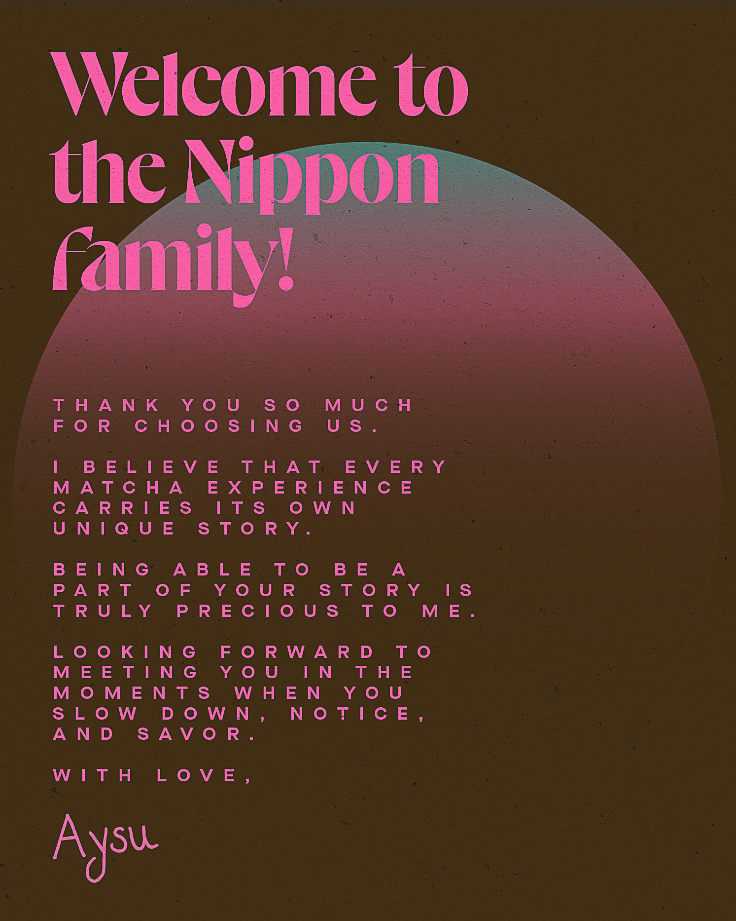
At Ba’ndo, we had the privilege of shaping the brand identity for Nippon, a challenger wellness brand introducing premium Japanese matcha and houjicha teas to Türkiye and Europe. More than just tea, Nippon thoughtfully brings the spirit and rituals of the East into the lives of a fast-moving, wellness-curious Western audience. Rooted in transparency, Nippon exists to surface the overlooked realities of the global matcha industry through bold storytelling, thoughtful design, and a visual language that speaks with clarity and intention. Our work spanned from strategy to design: building a brand world that celebrates originality, encourages conscious consumption, and invites slower living — one cup at a time.
WHY THE RUSH?
Crafting the Essence of Nippon
At Ba’ndo, we had the privilege of shaping the brand identity for Nippon, a challenger wellness brand introducing premium Japanese matcha and houjicha teas to Türkiye and Europe. More than just tea, Nippon thoughtfully brings the spirit and rituals of the East into the lives of a fast-moving, wellness-curious Western audience. Rooted in transparency, Nippon exists to surface the overlooked realities of the global matcha industry through bold storytelling, thoughtful design, and a visual language that speaks with clarity and intention. Our work spanned from strategy to design: building a brand world that celebrates originality, encourages conscious consumption, and invites slower living — one cup at a time.
A Harmonious Blend of Tradition and Modernity
Nippon is not just about tea. It’s a quiet invitation in the West to slow down, challenge the pace, and find presence in everyday rituals. It bridges two seemingly different worlds: those who honor the depth and precision of Japanese tea culture, and those who turn to matcha as part of a modern, health-driven lifestyle. Somewhere in between, a more grounded and sustainable form of wellness takes shape. We approached the brand with this balance in mind, respecting centuries-old tradition while shaping a visual and strategic identity that feels current, dynamic, and bold. Our goal was to create more than a look; we wanted to build a world. One that invites ritual, nurtures community, and transforms a simple cup of tea into an intentional way of living.
A Design Rooted in Meaning
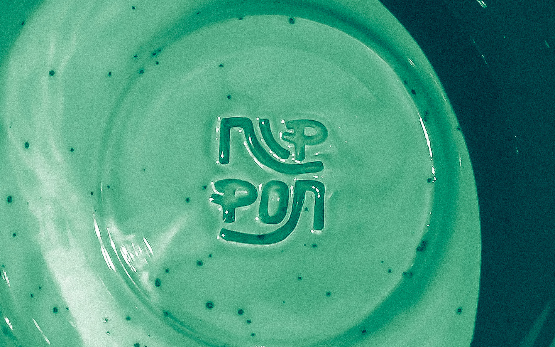
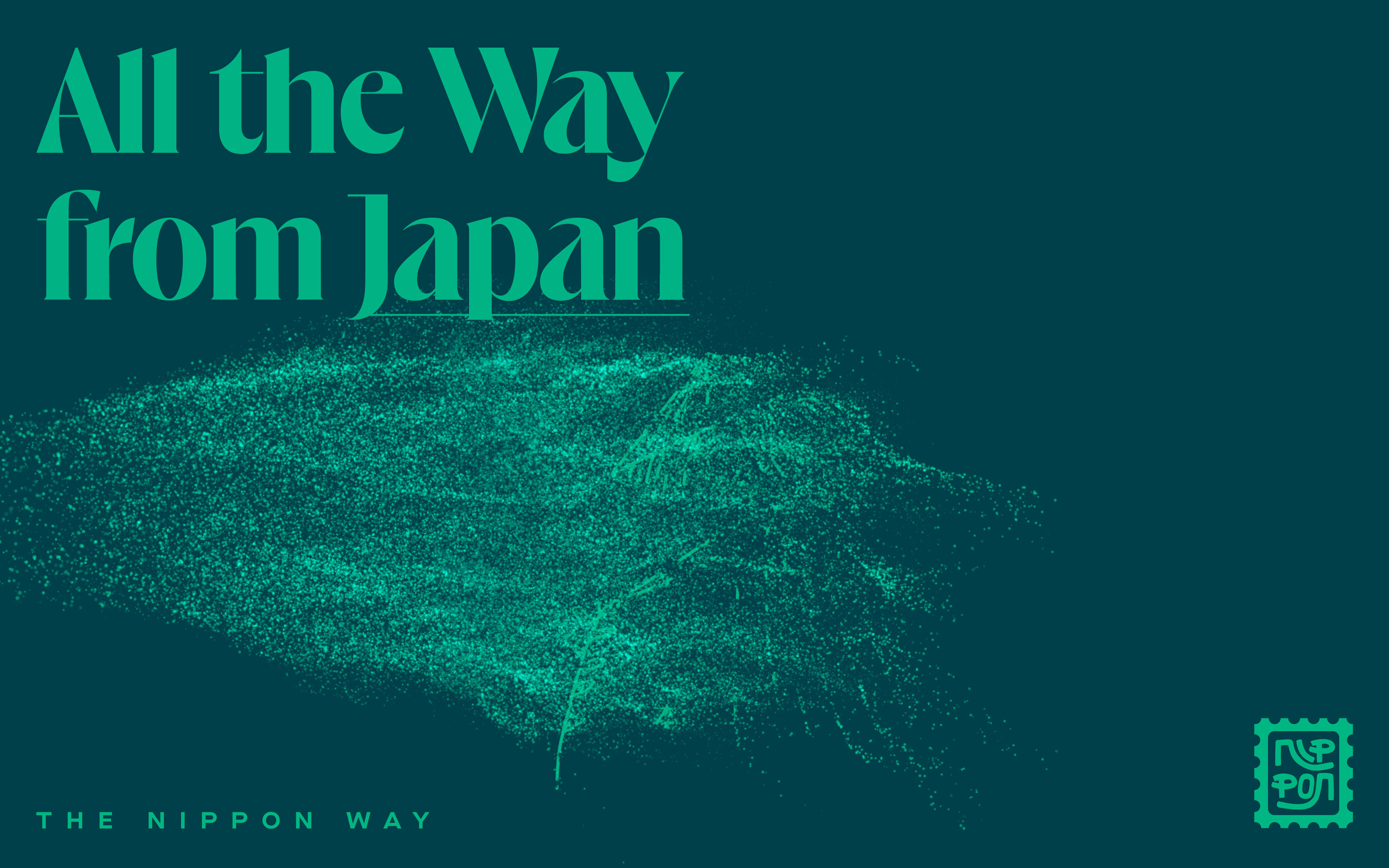
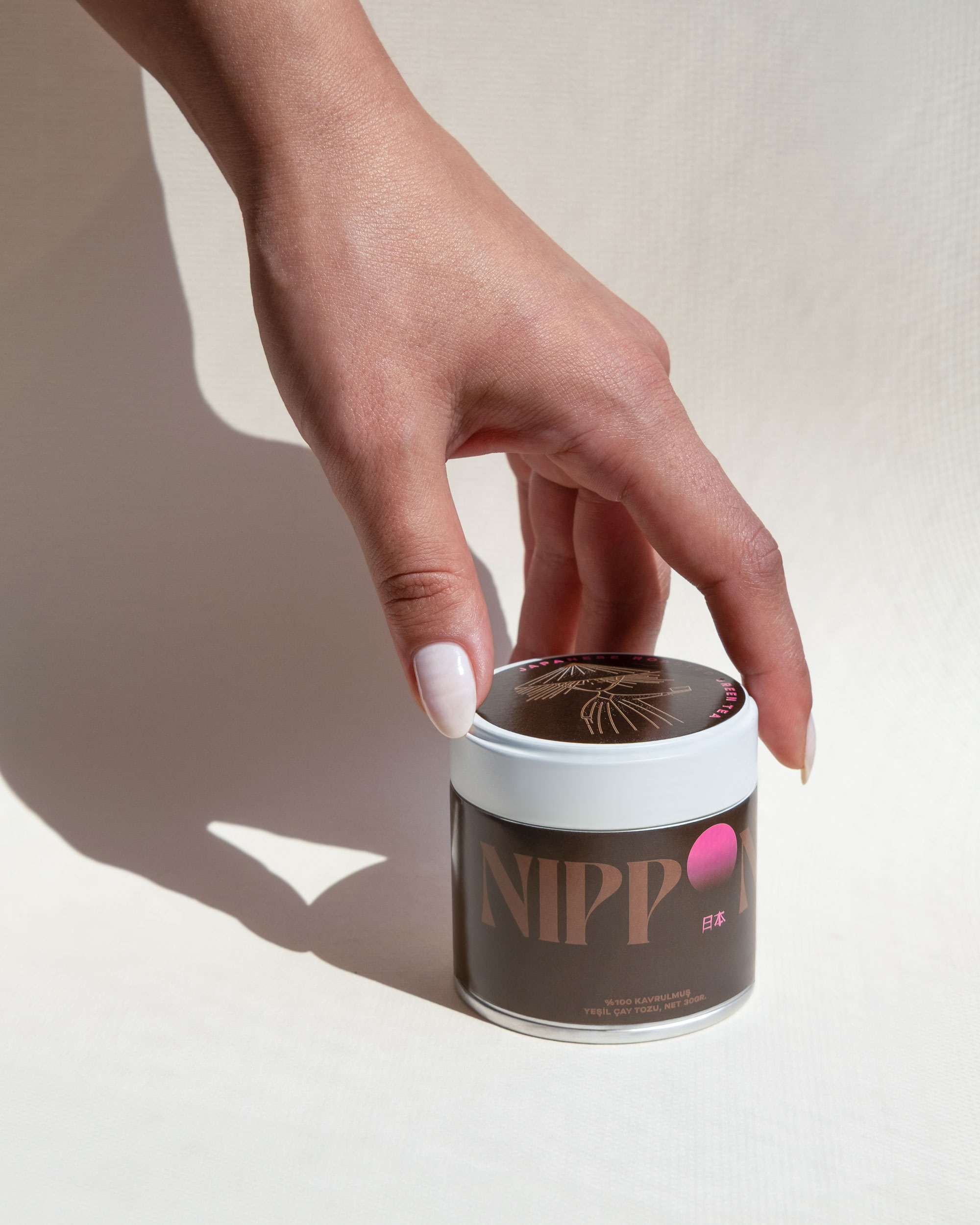
The Nippon logo was carefully designed to capture the essence of our brand. One distinctive element sets it apart: the elevated ‘O’, which carries deep symbolic meaning. It represents the rising sun, a tribute to Japan’s identity as the “Land of the Rising Sun.” It also echoes the shape of a traditional matcha bowl, reinforcing the brand’s focus on its signature product, matcha. Our typography is both modern and elegant, reflecting the refined aesthetics of Japanese minimalism. The long, sleek letterforms enhance the overall sense of sophistication and balance.
A Palette Inspired by Nature and Culture
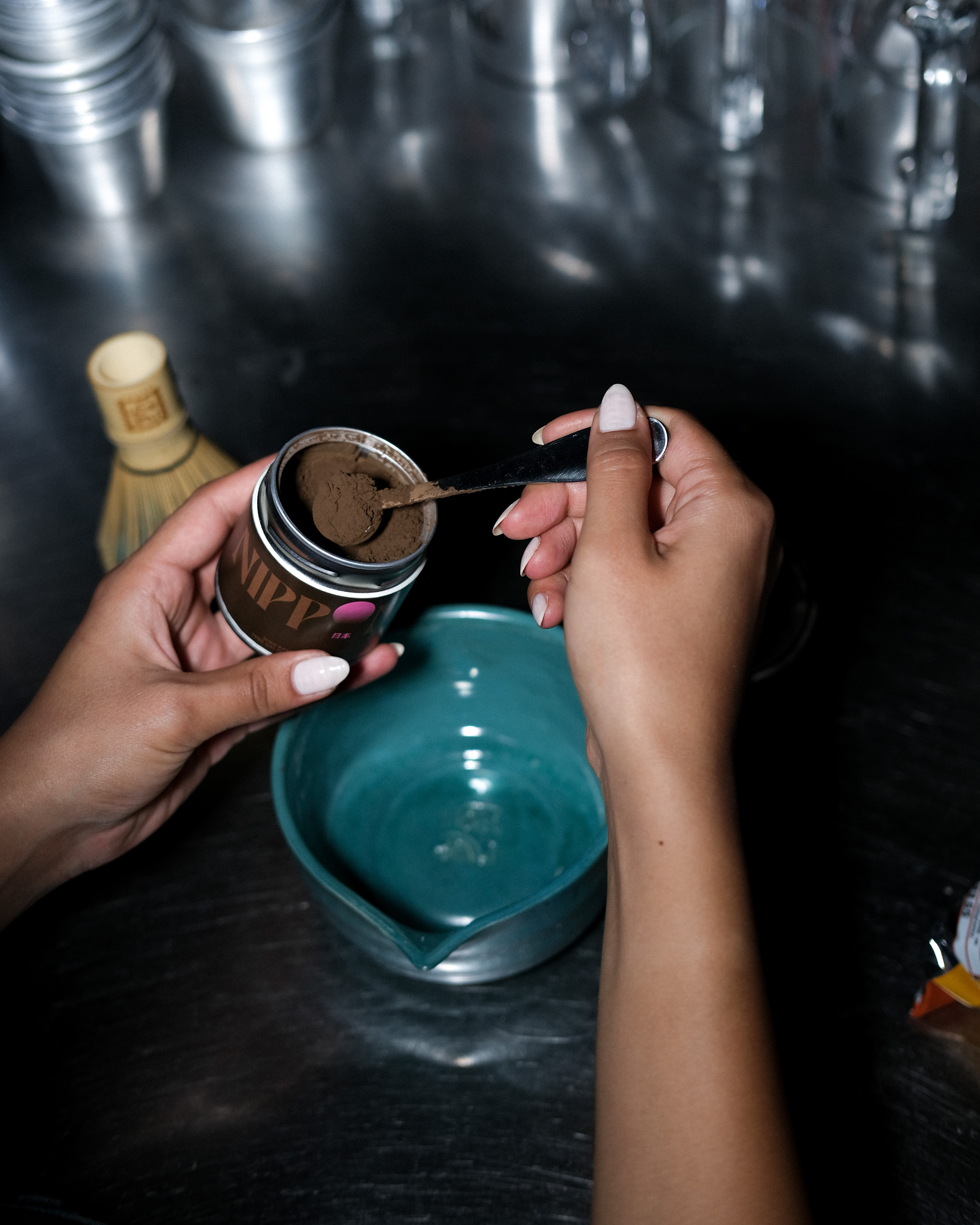
Our color choices for Nippon were inspired by nature and cultural symbolism. Deep green reflects the rich, organic quality of matcha and the brand's roots in nature. Soft pink, drawn from cherry blossoms, evokes renewal, presence, and the fleeting beauty of life. Warm golden tones mirror the rising sun, honoring tradition and quiet strength. Together, these colors create a balanced visual language, one that expresses tranquility, intention, and refined quality.
The Power of Typography
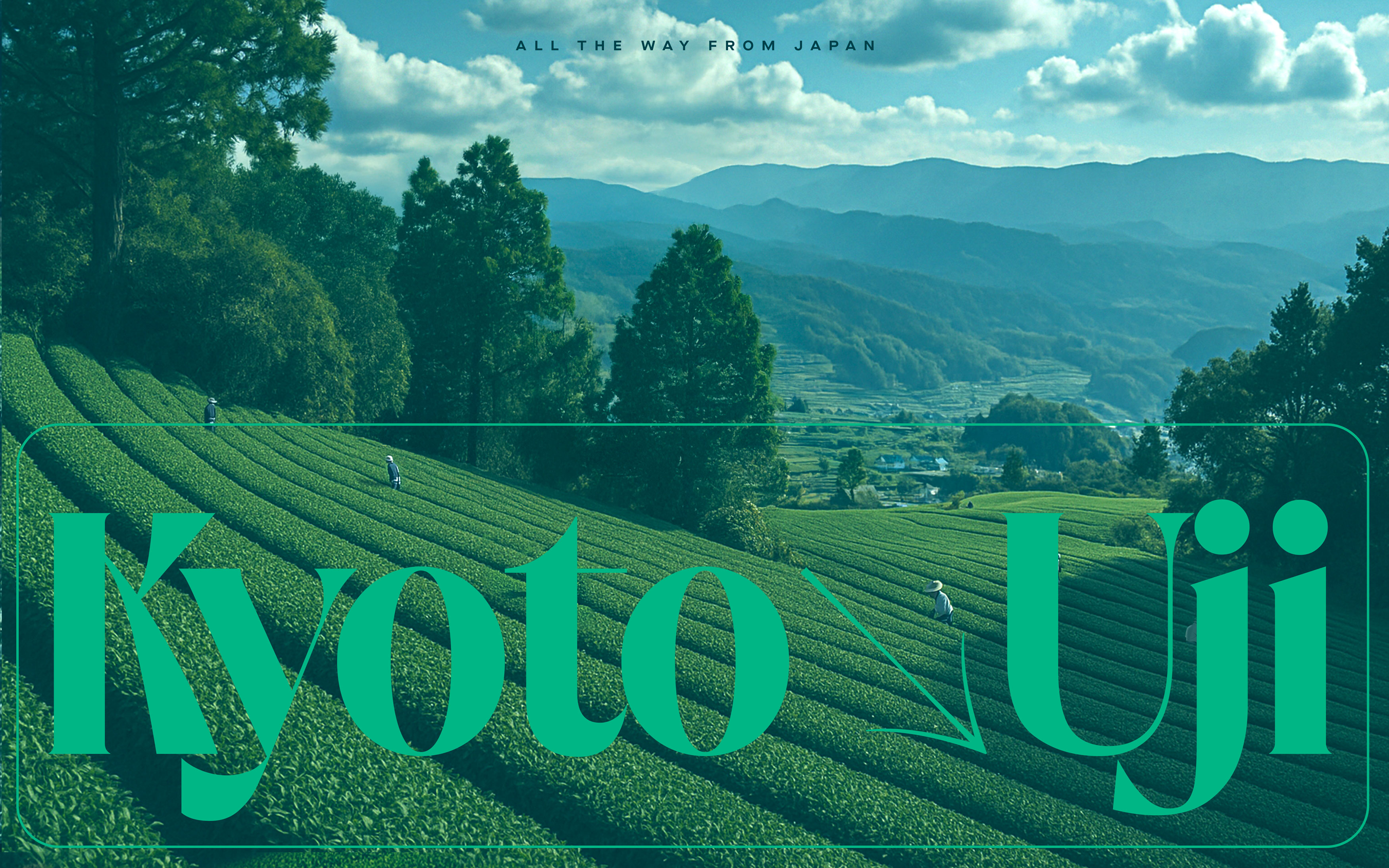
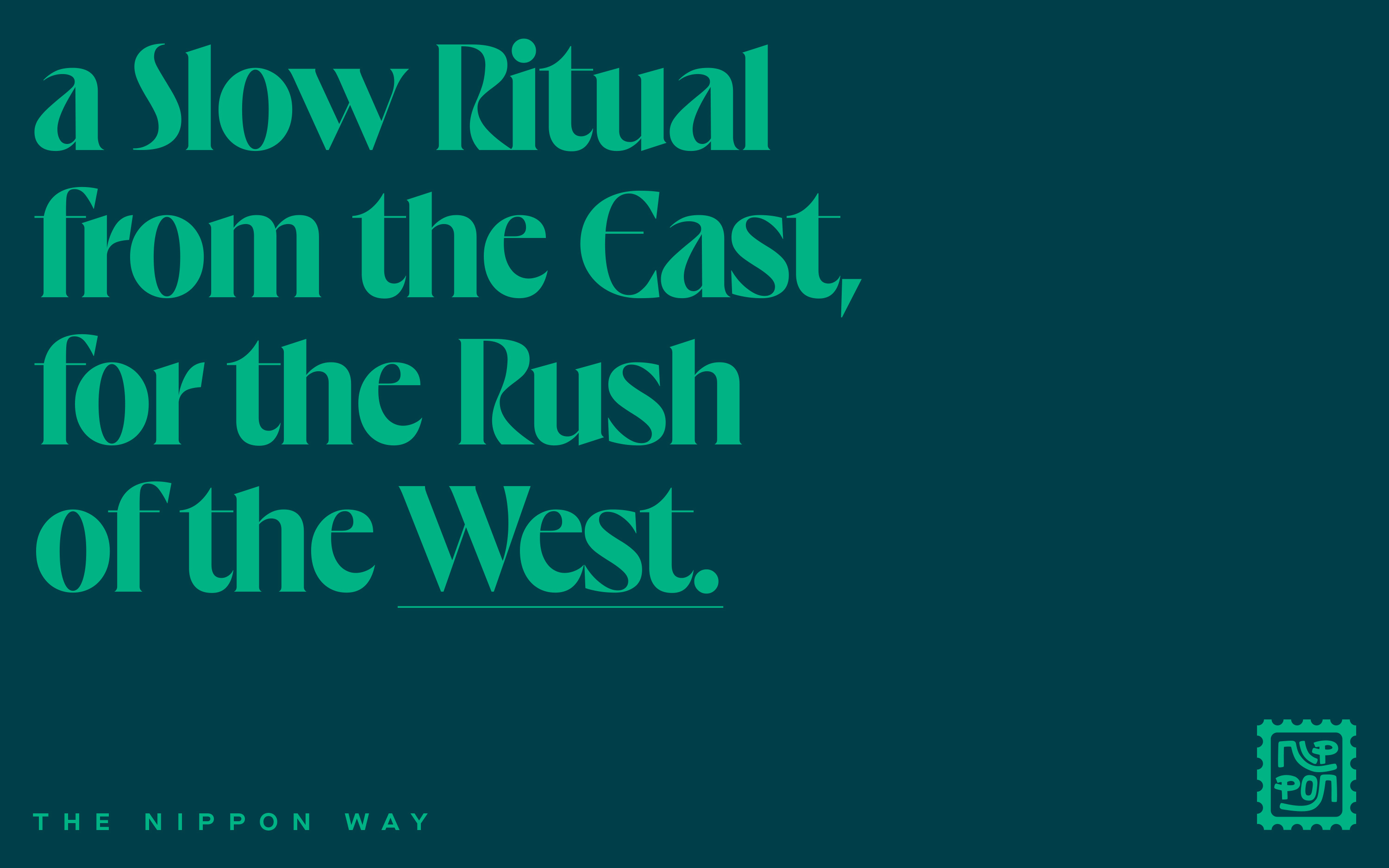
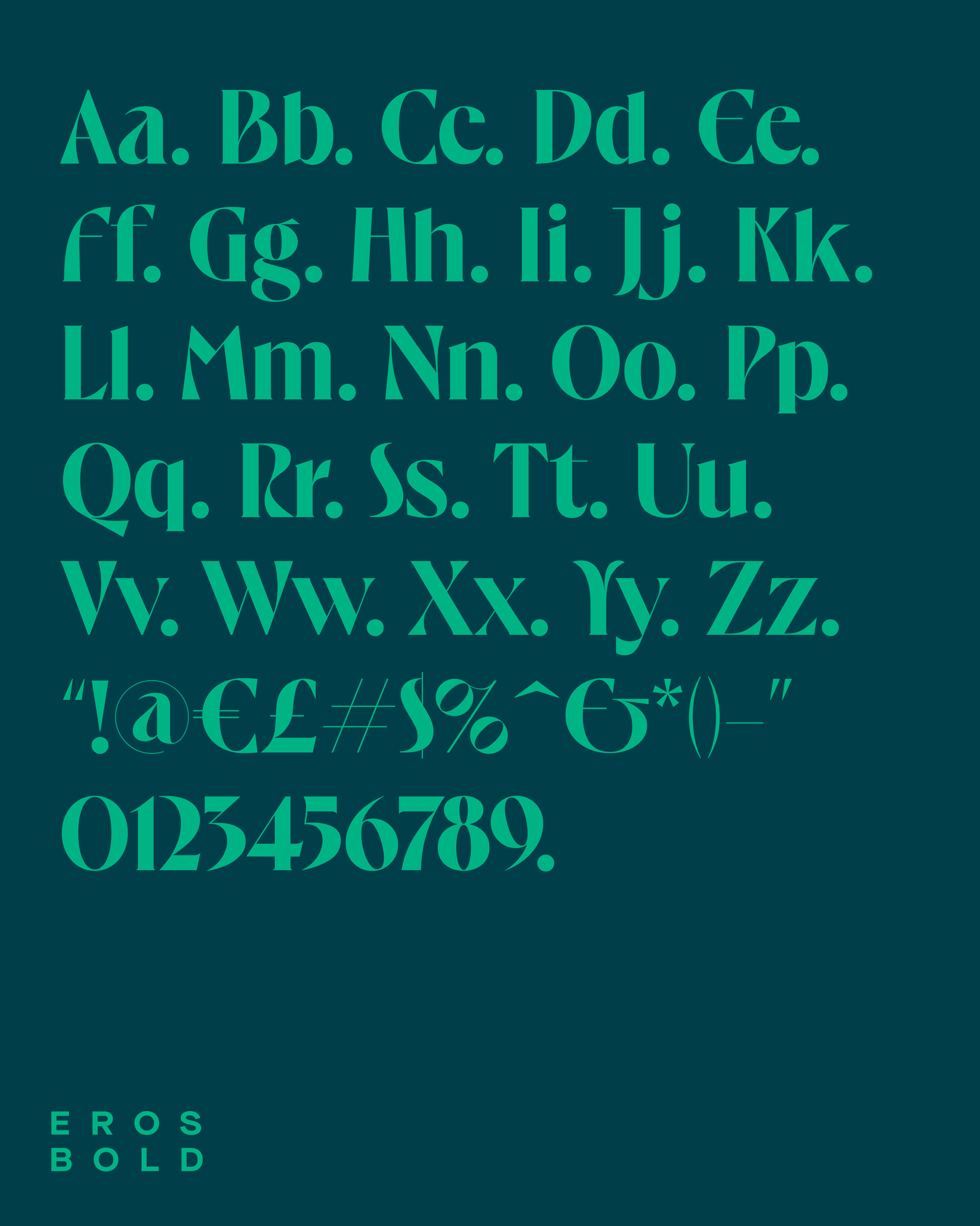
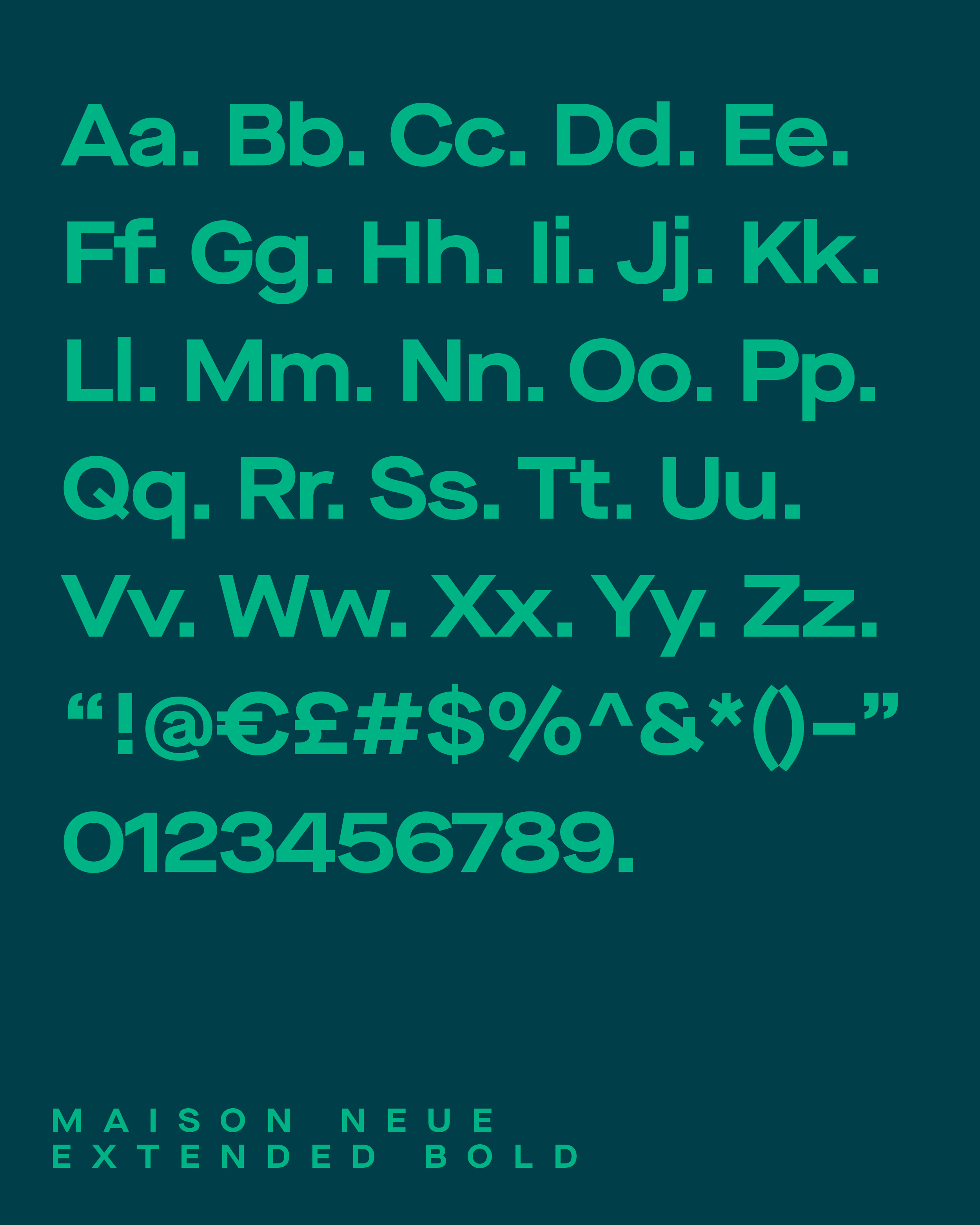
Our typographic choices reflect both strength and elegance. The bold, sans-serif fonts used in Japan’s Golden Sun and Nippon Way convey confidence, clarity, and modernity. The high-contrast serif fonts in Uji Kyoto add a refined touch, paying homage to traditional Japanese calligraphy. The interplay between modern grotesque typefaces and delicate serif details perfectly captures our brand’s dual essence, deeply rooted in tradition yet shaped by a contemporary vision.
Patterns that Tell a Story
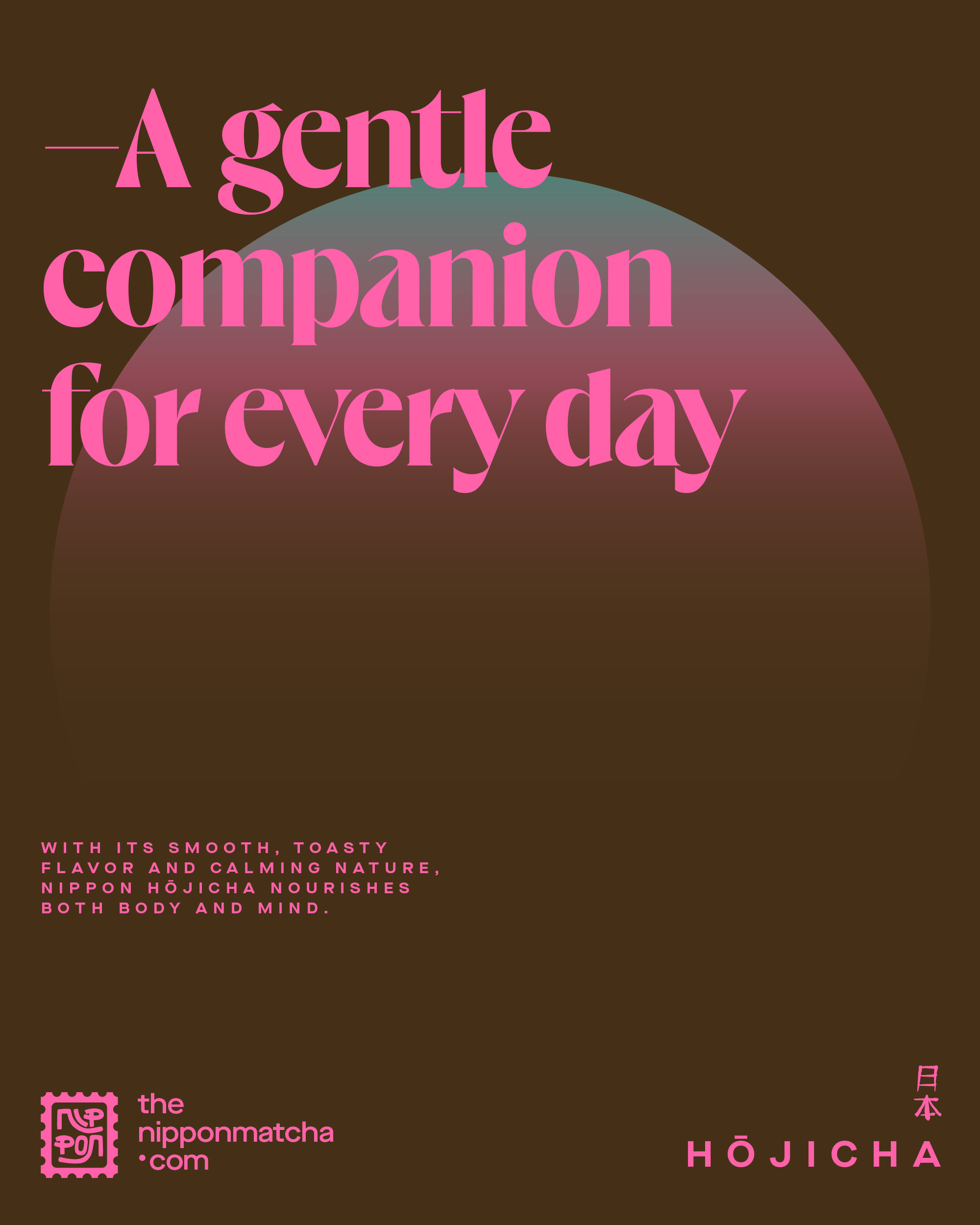
Rooted in Japanese aesthetics, our brand patterns reimagine traditional motifs through a modern lens. The interplay of organic and geometric forms creates a visual language that feels both serene and engaging. Each element carries quiet symbolism, adding depth and authenticity to the brand. A signature pink sun anchors our visual identity, appearing consistently across every touchpoint—honoring the Japanese tea ritual while symbolizing renewal, unity, and the simple truth that the sun rises for everyone, everywhere. It serves as a gentle metaphor for connection across regions, a shared light under which East and West meet.
Illustrating the Ritual
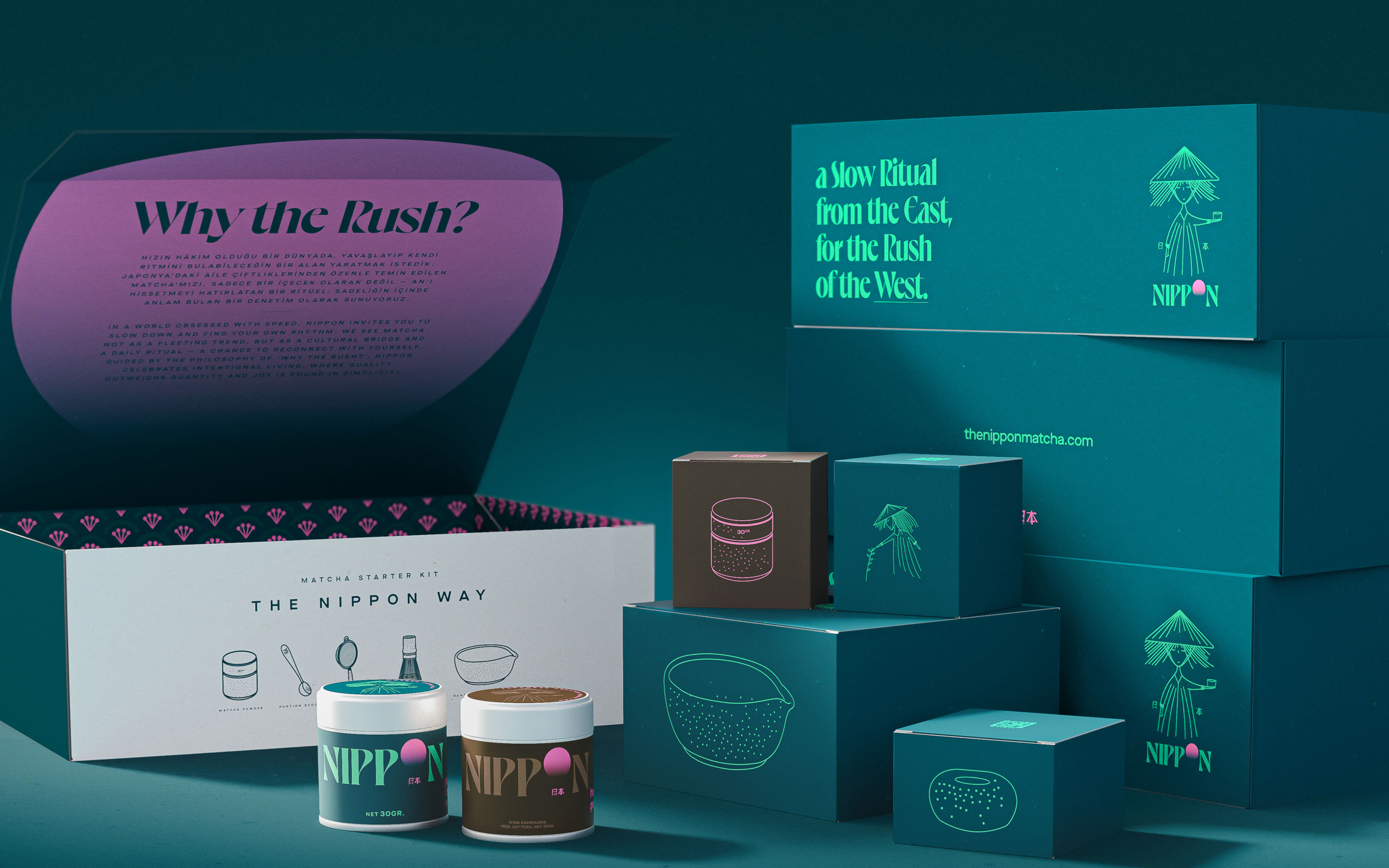
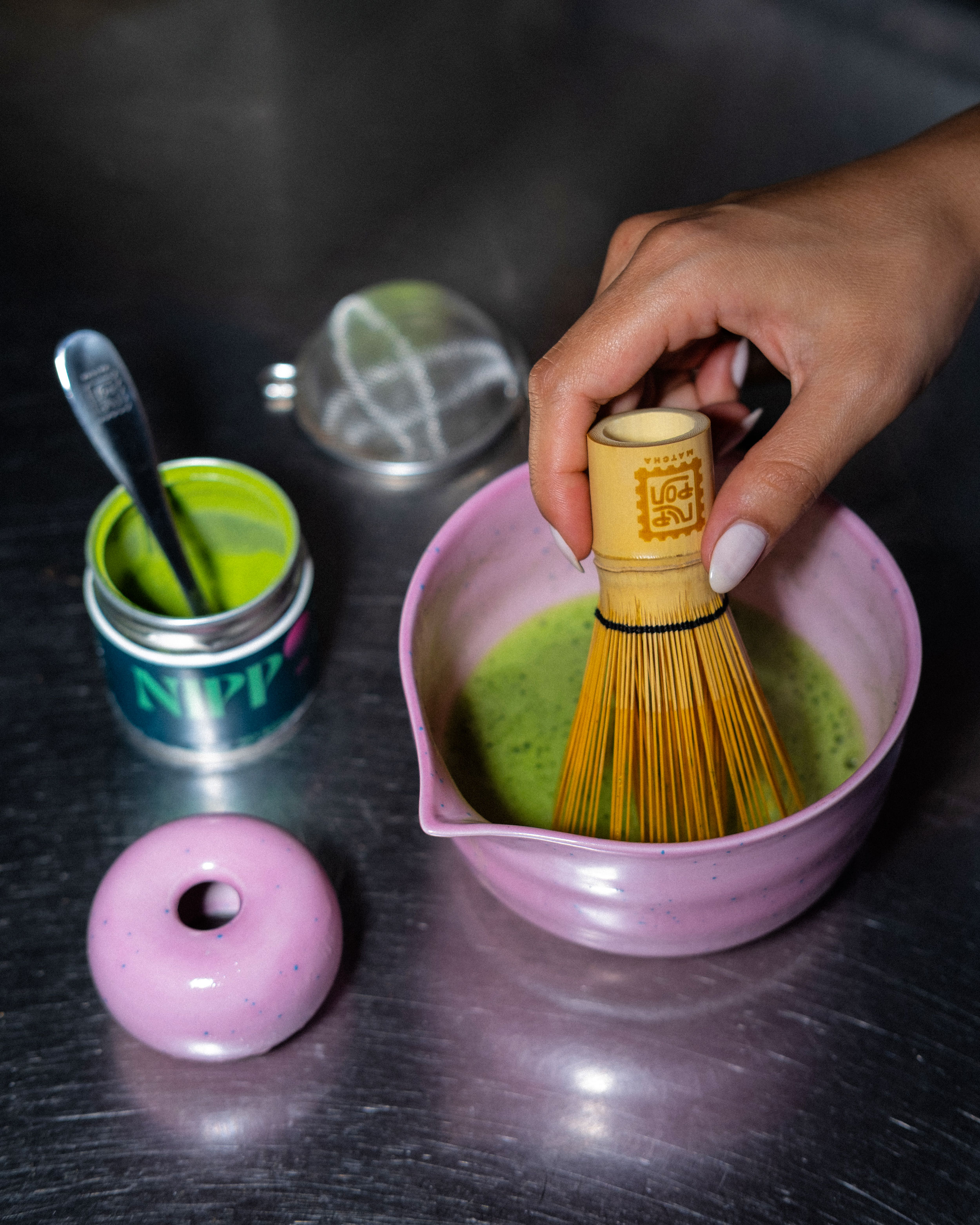
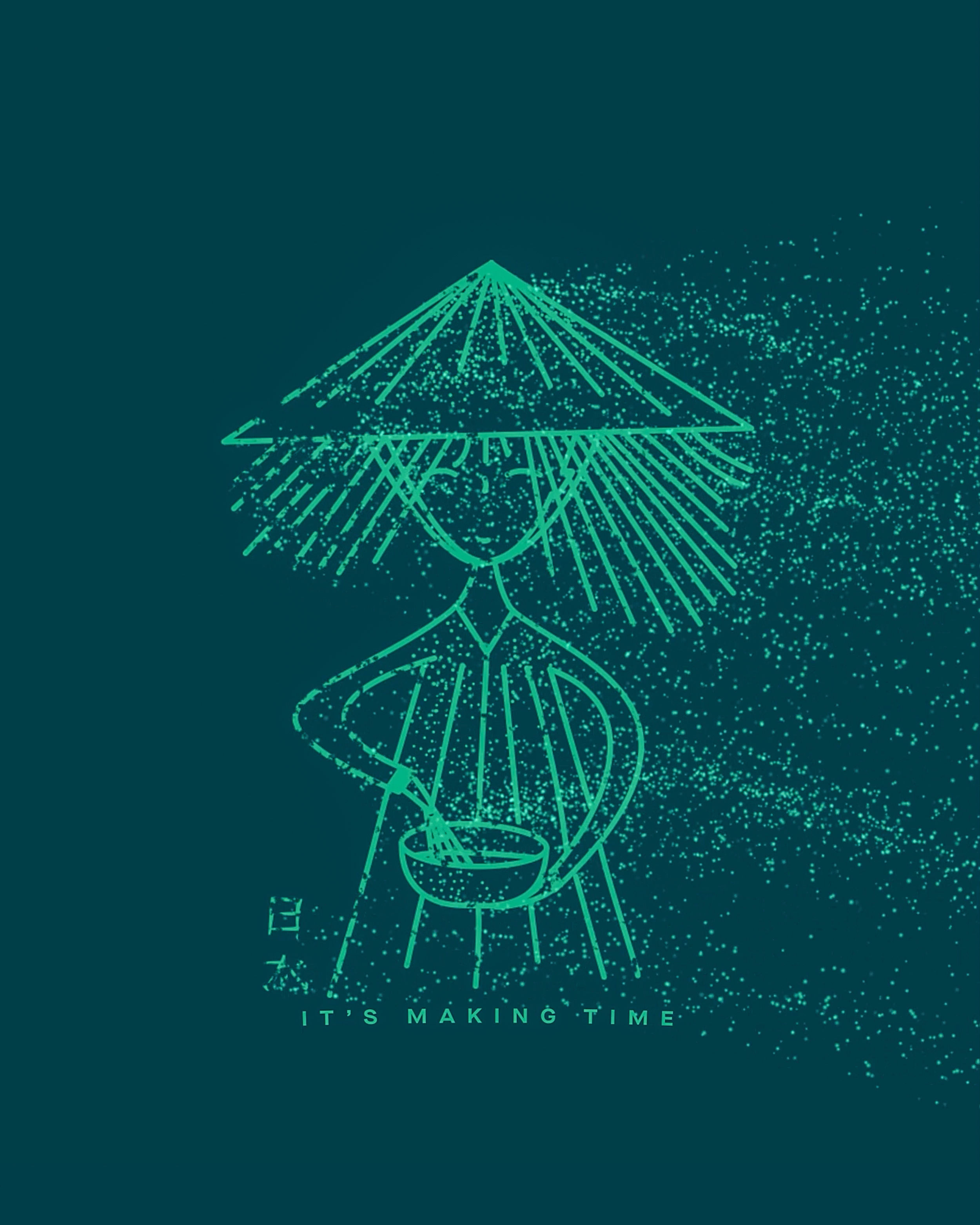
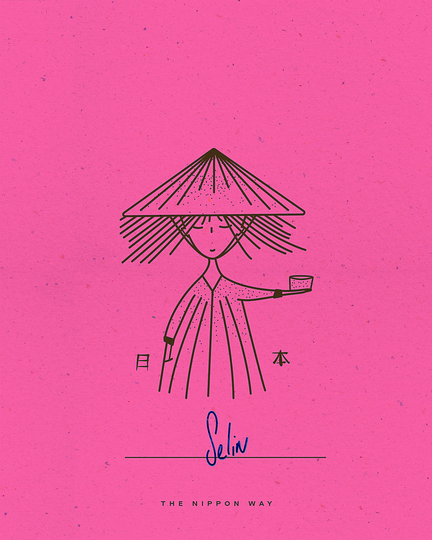
Our illustration approach is minimalist yet bold, capturing the essence of what Nippon gently challenges: the adaptation of Japan’s matcha tradition to the fast-paced rhythm of the Western world. Hand-drawn aesthetics reflect artisanal craftsmanship and authenticity. By portraying figures engaged in tea growing and preparation with contemporary simplicity, we strike a balance between tradition and modernity. These illustrations depict serene moments of tea-making, inviting viewers to embrace intentional living.
A Call to Slow Down: Why the Rush?
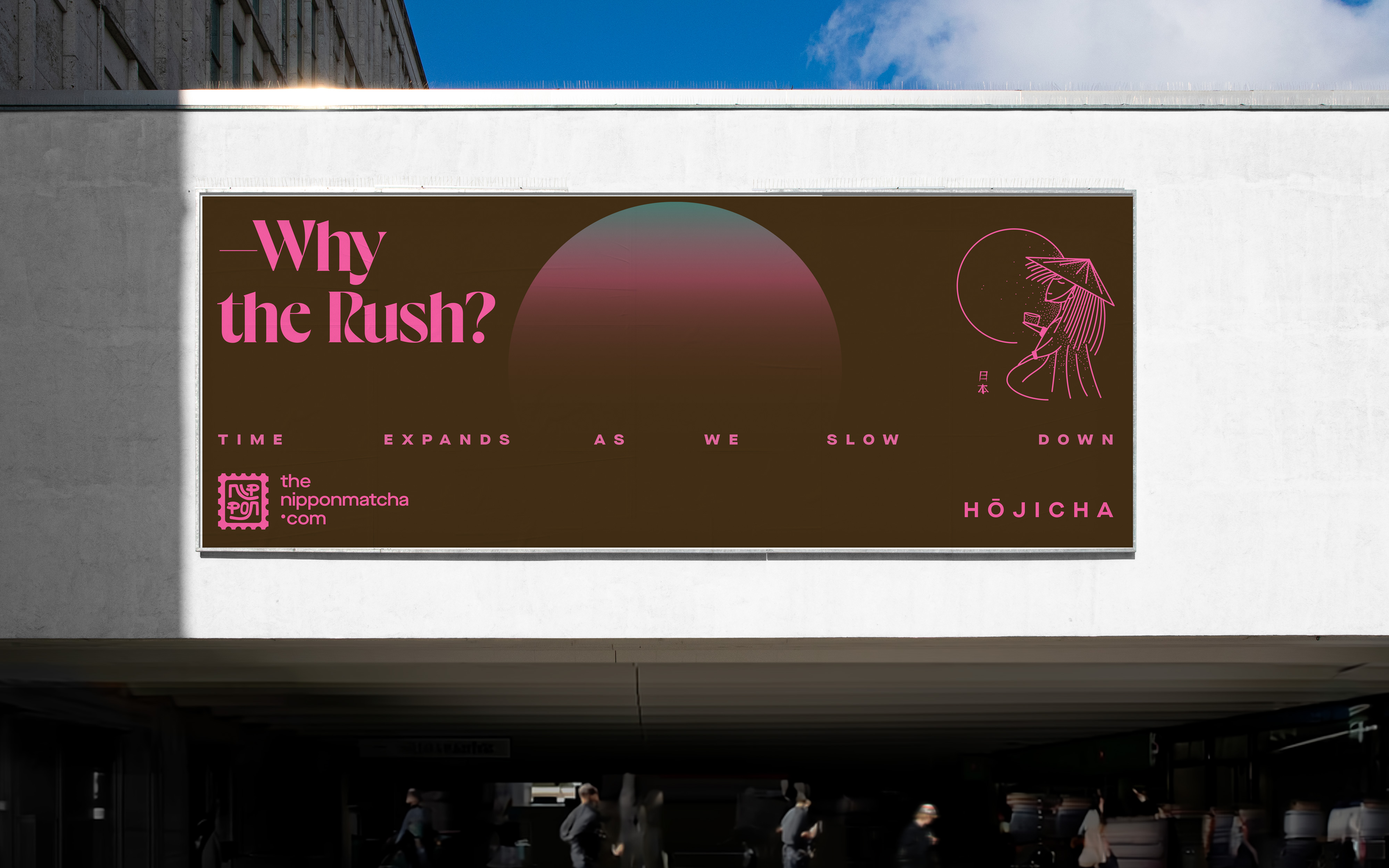
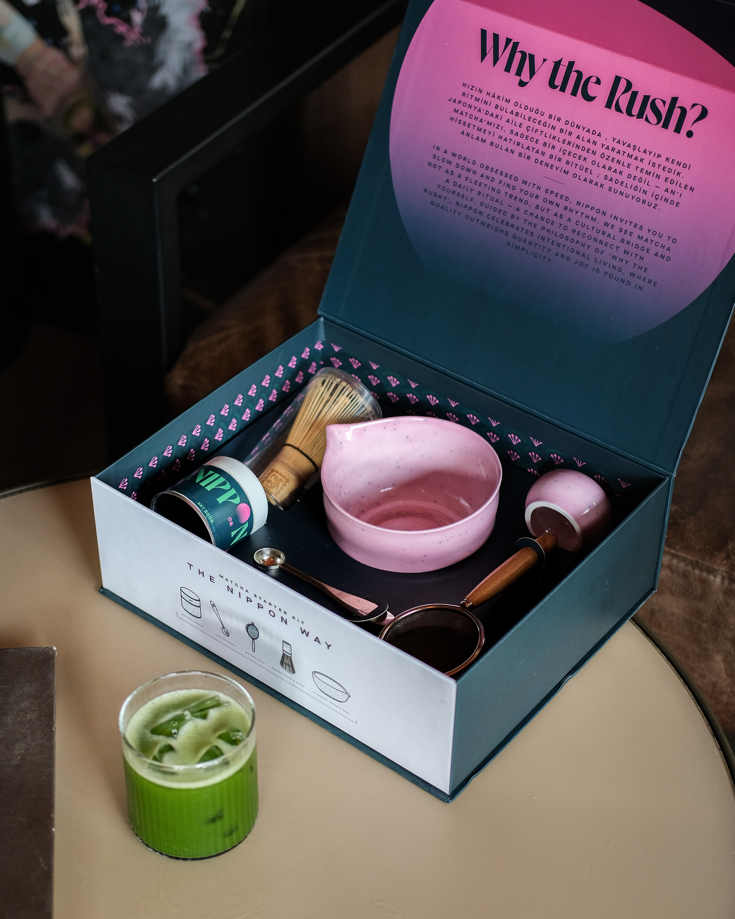
In a world driven by speed and efficiency, Nippon offers a quiet reminder to pause and reflect. Guided by the philosophy, “Why the rush?”, we invite a slower, more intentional rhythm, one that values presence over productivity and connection over consumption.
While many brands treat matcha as a fleeting wellness trend, often focusing solely on modern aesthetics, Nippon sees it as a cultural bridge, a companion, and a ritual to be savored. From sourcing to preparation to the first sip, matcha becomes a moment of stillness in a world that rarely stops. It is a daily invitation to slow down and reconnect, with ourselves and with others.
Beyond its physical benefits, matcha reflects a way of living: where quality outweighs quantity, and depth replaces urgency. At Nippon, we embrace this philosophy by nurturing belonging within our community and encouraging joy in the simplest of moments. Whether shared in a quiet morning, a mindful pause in a busy day, or a gathering with loved ones, each sip becomes a gentle reminder that time is most meaningful when it’s fully felt.
By returning to the essence of meaningful pauses, Nippon redefines balance—not as doing less, but as living with intention. The art of matcha becomes an anchor: a way to find stillness amidst chaos, presence amidst distraction, and fulfillment amidst the noise of more.
Mottos That Define Nippon
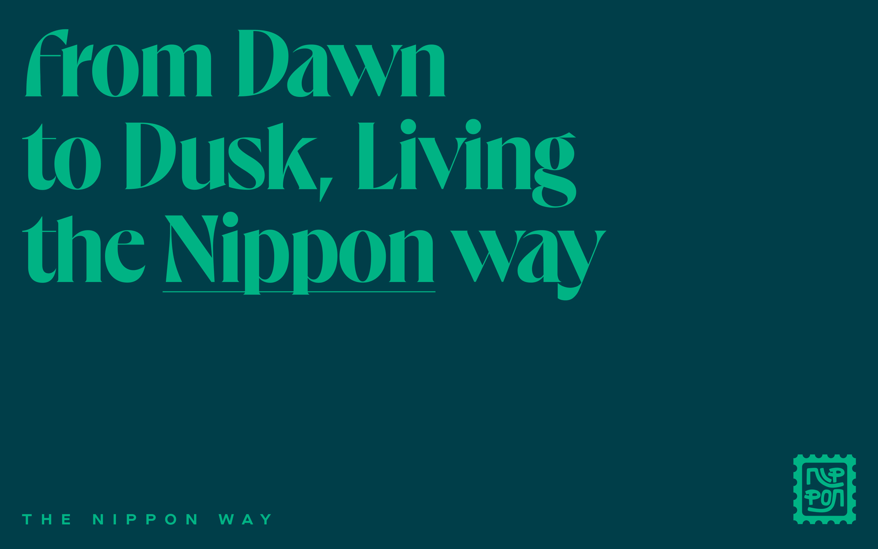
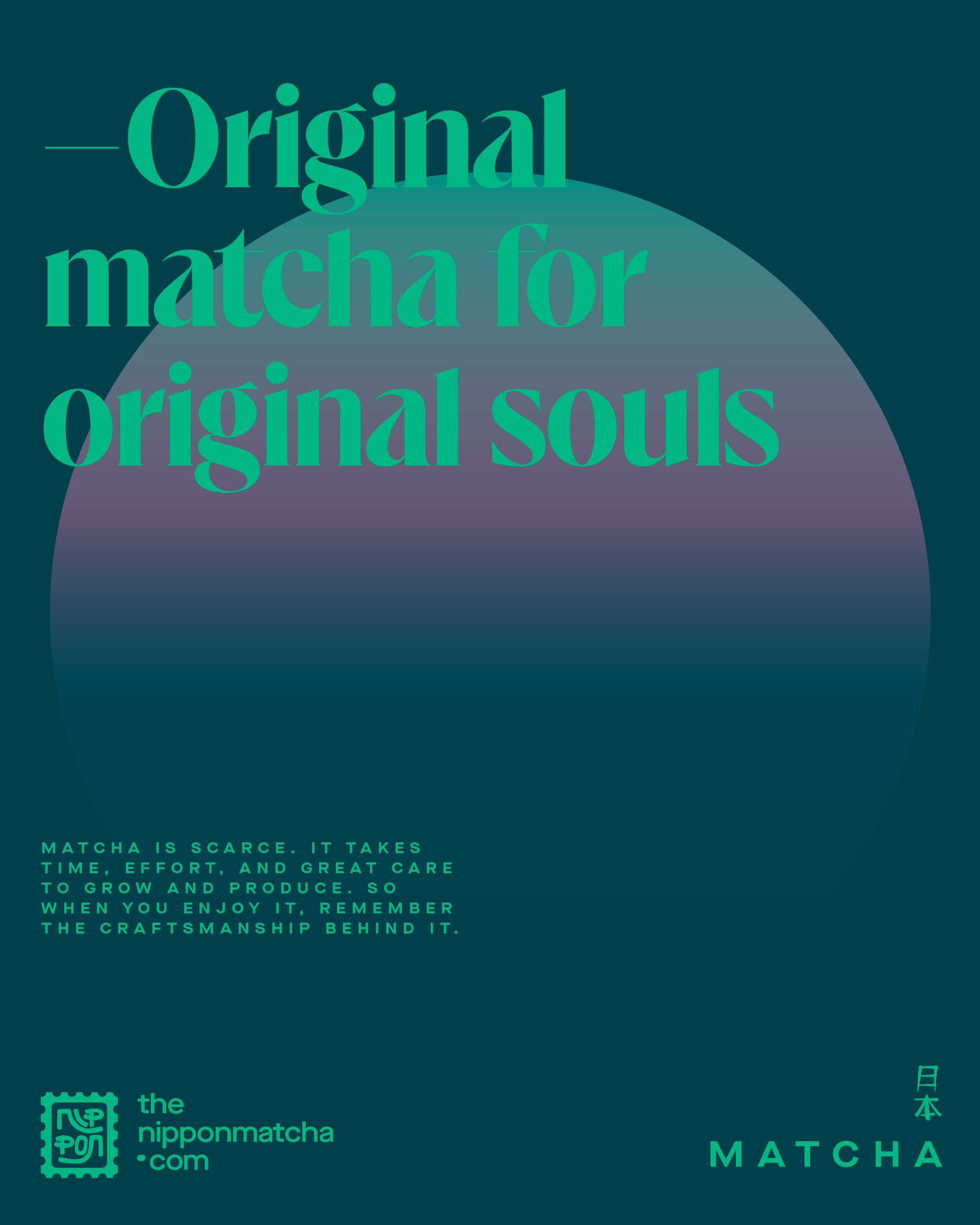
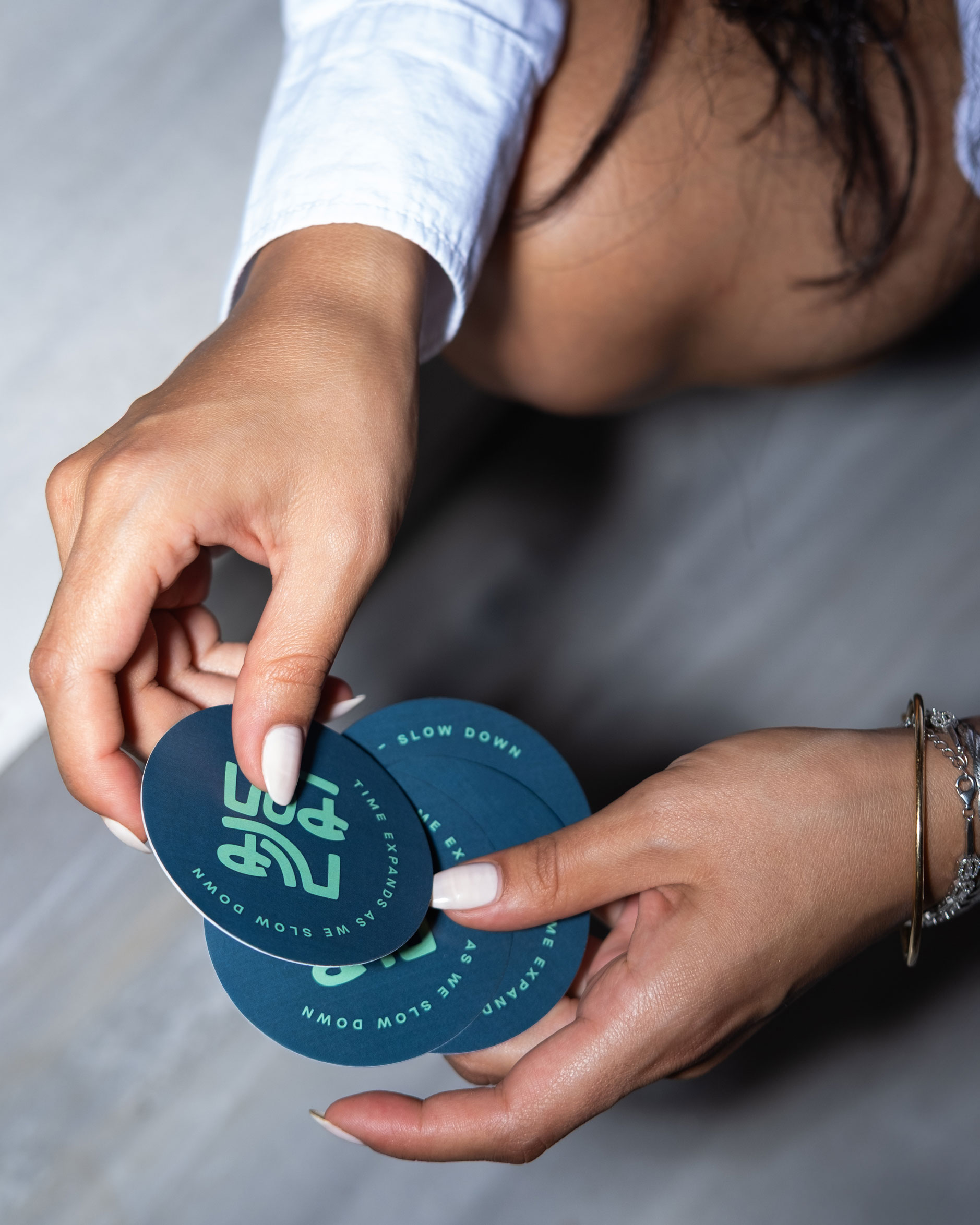
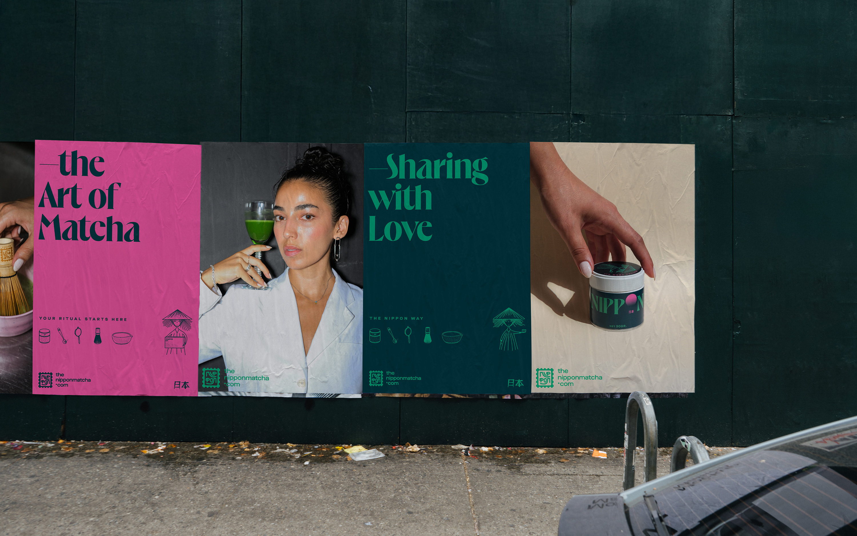
The Nippon Way. The Art of Matcha. Original Matcha for Original Souls. Sourced with Intention, Shared with Passion. Time Expands as We Slow Down.
Bringing Nippon to Life
Ba’ndo’s approach to Nippon’s branding centered on creating a holistic system that reflects the brand’s values, story, and quiet strength. From the precisely crafted logo to the expressive hand-drawn illustrations and intentional messaging, every element was designed to resonate with those who honor tradition while embracing contemporary wellness. We believe the food and wellness space has room for more brands that lead with transparency, sustainability, and the courage to do things differently. To us, Nippon is more than a tea brand—it’s an invitation to live and consume with care and clarity. Through refined design and bold storytelling, we brought to life an identity that reflects a new way of being.
CREDITS
| Ba'ndo |
Creative Director
|
| Fonts |
Eros
|
| Client |
Nippon
|
